Essential CSS Interview Questions Explained
CSS, short for Cascading Style Sheets, serves as a cornerstone in contemporary web development, dictating the visual aesthetics and layout of web pages. Whether novice or seasoned, individuals traversing the realm of web development often encounter CSS hurdles in job interviews. Proficiency in navigating CSS complexities and demonstrating a firm grasp of its principles prove pivotal in interview success. This guide plunges into CSS interview inquiries, divulging insights to empower you in acing your next CSS-centric interview.
What about Fundamental CSS Interview Questions?
What Constitutes CSS?
CSS, an acronym for Cascading Style Sheets, functions as a style sheet language employed to define the appearance and arrangement of HTML or XML documents. It acts as the design language of the web, enabling developers to craft visually appealing and structurally sound web pages.
CSS is indispensable for modern web design, providing a powerful toolset for designers to manipulate font styles, colors, spacing, and layout without altering the HTML structure. It offers a myriad of selectors for targeting elements, enabling precise control over the webpage’s look and feel. By separating the presentation layer from the content, CSS ensures that web applications are more accessible and easier to manage. Developers leverage CSS to create responsive designs that adapt seamlessly to different screen sizes, enhancing user experience across devices. CSS’s cascading nature allows multiple style sheets to influence a single HTML document, enabling a hierarchical approach to styling that can override styles based on specificity, inheritance, and the source of the style sheet. This feature facilitates the customization of standardized templates and the application of theme-based styles, making CSS a cornerstone of web aesthetics and functionality.
Integrating CSS into Webpages
Incorporating CSS into a webpage is achievable either through the `<link>` element within the HTML `<head>` section or by directly utilizing the style attribute within HTML elements. This integration facilitates the separation of content and presentation, enhancing the maintainability and scalability of web projects.
This dual method of integration offers flexibility in how styles are applied, catering to the specific needs of a project. Using the `<link>` element to connect external CSS files helps maintain a clean HTML structure, making the code easier to read and manage. It allows web designers and developers to centralize style definitions, which can be particularly beneficial for large-scale projects where consistency across multiple pages is crucial. Meanwhile, the style attribute provides a convenient way to apply quick, one-off styles without the need for an external stylesheet. This can be useful for testing purposes or when a specific style is only needed for a single element. However, overreliance on inline styles can lead to cluttered HTML and challenges in style management, highlighting the importance of thoughtful integration of CSS to ensure a balance between flexibility and maintainability.
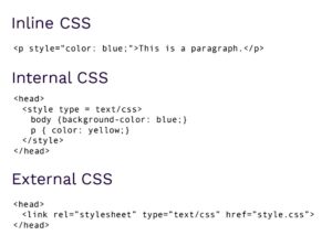
Distinguishing Inline, Internal, and External CSS
Inline CSS is directly applied within HTML elements via the style attribute, offering granular control over individual elements’ styling. Conversely, internal CSS resides within `<style>` tags in the HTML `<head>` section, allowing for broader styling directives across multiple elements. External CSS, encapsulated within separate files and linked using the `<link>` element, promotes code reusability and facilitates consistent styling across multiple pages.
Each method serves distinct purposes and comes with its own set of advantages. Inline CSS is ideal for quick, element-specific adjustments, ensuring that specific styling rules take precedence over those defined elsewhere. Internal CSS is useful for styles that are unique to a single page, allowing for a centralized location of CSS rules within the HTML document itself. This method is often used for small-scale projects or individual pages that do not require extensive styling. External CSS, on the other hand, is the most scalable and efficient approach for larger projects. It separates styling from HTML content, thereby reducing file size and improving site performance. By storing styles in external files, developers can ensure uniformity across multiple web pages, making global changes more manageable. The choice between inline, internal, and external CSS ultimately depends on the project’s scale, complexity, and specific requirements, with each method offering unique benefits tailored to different scenarios.
Mastering CSS Selectors
CSS selectors are patterns employed to select and style specific elements within an HTML document, encompassing element selectors, class selectors, and ID selectors. By leveraging selectors effectively, developers can precisely target and style elements, ensuring a cohesive and visually appealing layout.
Manipulating Text Color with CSS
Text color alterations in CSS are executed through the colour property, specifying desired coloration such as red, blue, or any other hue. This property enables developers to customize text appearance to align with brand identity or design requirements, enhancing visual coherence and user experience.
Unveiling the Box Model
The box model elucidates the structural framework of CSS elements, encompassing content, padding, border, and margin, collectively determining an element’s overall size and spacing. Understanding the intricacies of the box model is essential for crafting responsive and visually appealing layouts, ensuring optimal user engagement across various devices and screen sizes.
Achieving Horizontal and Vertical Element Alignment
Horizontal center alignment is facilitated by margin: 0 auto; paired with a defined width, while vertical alignment employs display: flex; alongside align-items: center; within a designated container. These techniques enable developers to achieve precise element positioning and alignment, enhancing layout consistency and visual harmony.
Unraveling CSS Pseudo-Classes
CSS pseudo-classes, denoted by keywords, selectively target specific states or elements within a document, facilitating dynamic styling based on user interactions or element attributes. By leveraging pseudo-classes effectively, developers can create interactive and engaging user interfaces, enriching the overall user experience.
Tailoring CSS for Specific Browser Versions
CSS vendor prefixes, such as -webkit- for WebKit-based browsers and -moz- for Firefox, enable the application of browser-specific CSS rules, ensuring optimal rendering across diverse platforms. This approach ensures cross-browser compatibility and consistent user experiences, mitigating potential styling discrepancies across different browser environments.
Intermediate-level CSS Proficiency
Navigating CSS Box-Sizing and Media Queries
The box-sizing property regulates element width and height calculation, distinguishing between content-box and border-box models. Media queries enable adaptive styling based on device or viewport characteristics, empowering developers to create responsive and accessible web designs across various screen sizes and resolutions.
Discriminating Between Inline and Inline-Block Displays
Display properties of inline and inline-block govern element behavior concerning line alignment and block-level attributes, impacting layout composition. Understanding the nuances between these display types enables developers to implement flexible and responsive layouts, accommodating diverse content structures and design requirements.
Crafting Responsive Designs with CSS
Responsive web design entails employing CSS media queries, fluid layouts, and flexible image scaling to ensure optimal rendering across varying screen sizes and resolutions. By adopting responsive design principles, developers can deliver seamless user experiences across desktops, tablets, and smartphones, fostering accessibility and usability.
Harnessing the Power of Float Property
The float property enables element positioning outside the normal document flow, facilitating intricate layout designs and image alignment within text content. By leveraging float property effectively, developers can create multi-column layouts and visually compelling designs, enhancing content presentation and user engagement.
Text Vertical Alignment Techniques
Vertical text alignment in CSS is contingent upon the element’s display property, with inline or table-cell elements leveraging the vertical-align property for alignment, while flexbox or grid systems accommodate block-level elements. These techniques enable developers to achieve consistent and visually appealing text alignment, improving readability and user experience.
Deciphering the CSS Z-Index and Transform Properties
Z-index dictates the stacking order of elements along the z-axis, impacting visual layering. Conversely, the transform property facilitates element transformations like rotation, scaling, and translation, fostering dynamic visual effects. By mastering these properties, developers can create immersive and engaging user interfaces, elevating the overall user experience.
Crafting Gradient Backgrounds and Smooth Transitions
CSS gradients, created via linear-gradient() or radial-gradient() functions, offer diverse color transitions. Meanwhile, the transition property enables seamless property value transitions, enriching user interactions. By incorporating gradients and transitions effectively, developers can create visually stunning and interactive web experiences, captivating users and driving engagement.
Mastering Advanced CSS Concepts
CSS preprocessors such as Sass, LESS, and Stylus, have revolutionized the way developers write CSS, offering advanced features that native CSS lacks. Variables allow for the easy reuse of values such as colors and fonts, making it simpler to maintain consistency across a website. Mixins enable the creation of reusable groups of CSS declarations that can be included in multiple CSS rules, reducing repetition and enhancing code readability. Functions and conditionals further extend the capabilities of CSS, enabling dynamic styling based on specific conditions, thus providing a more powerful and flexible styling toolkit.
Specificity is a fundamental concept in CSS that determines which styles are applied when there is a conflict between multiple declarations targeting the same element. It is calculated based on a set of rules that weigh different types of selectors, with inline styles being the most specific, followed by IDs, classes, attributes, and elements. Understanding and mastering specificity is crucial for developers to ensure that the intended styles are applied, avoiding unexpected results and making debugging easier.
By integrating CSS preprocessors and effectively managing specificity, developers can significantly improve their workflow, making the development process more efficient and less error-prone. These tools and concepts allow for better structured, modular, and maintainable codebases, which is particularly beneficial in collaborative environments where consistency and ease of understanding are paramount.
Table: Advantages of Using CSS Preprocessors and Managing Specificity
| Feature | Description | Benefits |
|---|---|---|
| Variables | Allow storing and reusing values for colors, fonts, etc. | Enhances consistency, simplifies maintenance. |
| Mixins | Facilitate the reuse of groups of CSS declarations. | Reduces repetition, improves readability. |
| Nested Selectors | Enable writing CSS in a hierarchical structure similar to HTML. | Makes code more intuitive and organized. |
| Functions & Conditionals | Offer dynamic styling capabilities based on conditions. | Increases flexibility and power of CSS. |
| Specificity Management | The method of determining which styles are applied in the case of conflict, based on a set of specificity rules. | Ensures correct styling is applied, simplifies debugging. |
By leveraging these preprocessors and specificity effectively, developers can streamline their CSS development workflows, maintain code consistency, and foster an environment conducive to collaboration and maintainability.
Harnessing CSS Grid Layouts and Animation
CSS grid layouts offer intricate two-dimensional structuring capabilities, contrasting with flexbox’s one-dimensional flexibility. CSS animation enables dynamic element animations without JavaScript dependency, fostering immersive user experiences. By incorporating grid layouts and animations, developers can create visually compelling and interactive web applications, enhancing user engagement and retention.
Leveraging @Media Rules and Performance Optimization
@Media rules tailor CSS styles to diverse output devices, optimizing user experiences. Performance optimization involves minimizing CSS files, utilizing CSS minification tools, and adhering to best practices to enhance loading speed. By optimizing media rules and performance, developers can ensure optimal performance and usability across various devices and network conditions, maximizing user satisfaction and engagement.
Navigating CSS Specificity Wars and Custom Properties
CSS specificity wars arise from conflicting CSS rules, mitigated by adopting simpler selectors and avoiding excessive specificity. CSS custom properties, unlike preprocessor variables, are resolved dynamically by browsers, enhancing code maintainability. By addressing specificity wars and embracing custom properties, developers can streamline CSS development processes and create scalable and maintainable codebases, fostering long-term project success and sustainability.
Conclusion: Empowering CSS Mastery
This narrative has delved into the intricacies of CSS interviews, spanning from fundamental concepts to advanced techniques. While this serves as a solid foundation, CSS remains an evolving discipline, necessitating continuous learning and exploration of emerging trends and methodologies for sustained proficiency. Practice, experimentation, and staying abreast of industry advancements are paramount in mastering the dynamic landscape of CSS. By embracing lifelong learning and staying curious, developers can unlock the full potential of CSS, driving innovation and excellence in web development.